
I'm a big fan of Patrick McKenzie's blog. If you're interested in small-time software business it's worth working through his greatest hits page. A powerful idea I learnt from his site is the conversion funnel: all the visitors to your site pour into the top, they then pass through several filter layers, and some proportion of them pop out at the bottom as paying customers. To get more paying customers you either need to put more users in the top, or get a higher proportion of them to pop out at the bottom.
In the 3 days it's been operational, the SMS Privacy home page has been viewed 5,000 times. I'm happy with that, as the sum total of my marketing efforts consist of an unsuccessful Hacker News post and 2 reddit posts.
This gave an opportunity to analyse the conversion funnel to see where improvements can be made.
5% of users who viewed the home page went on to view the signup page. I think this is fine. Anecdotally, I probably don't view the signup page of 5% of the websites I look at, so it's probably better than average.
Of the users who viewed the signup page, 30% went on to sign up (aside: I was pleasantly surprised to find that a full 10% of the users had signed up using the Tor hidden service!). Ordinarily this might be pretty good. It's certainly better than any of my previous projects. But given that the signup page only has 2 fields I'd think a majority ought to be persuaded to fill them in.
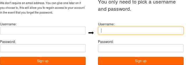
To make the page a bit more compelling I changed the boring paragraph of smallprint, and also made the username field autofocus. (I know, I know. I should be running independent A/B tests to determine the impact of each change independently. Still better than nothing.)
Of the users who signed up, 75% went on to view the "deposit funds" page. Very happy with this. On the first login the user is immediately greeted with "Woohoo! You're in. You'll need to deposit some funds", which seems to be working well.
Of the users who viewed the "deposit funds" page, 35% deposited some funds. The step where users have to part with some hard-earned cash is always going to have fairly high attrition, so I think 35% here is okay, though it's probably the next thing to optimise.
With any luck the sign up page conversion rate will improve over the next few days.
Update 2016-09-16: over the last 4 days, 42% of users who viewed the signup page went on to sign up, up from 30%. Excellent.